

You put color on your walls with the best of intentions but it turns out worst. You feel bad and start wondering, as to how could this happen, when you have used the high quality paints and you have put in many efforts to choose a color palette for your home décor.
Well, this simply means that you unintentionally you have committed color mistakes. The ideal way to avoid them is to know them. Here are some of the most common color mistakes you must avoid:
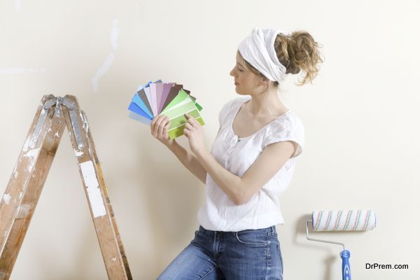
Relying completely on shade cards

There is nothing wrong with choosing paint colors using shade cards but depending upon them entirely is wrong. Before finalizing a particular hue from the card, you must ask the painters to paint a patch in that color on the wall. Likewise, ask them to show you patches of various colors. Ones you find suit your room the best, short-list them. This is the way to choose ideal paint colors for the walls.
Failing to consider natural light

Some people focus on one thing that darker colors in a room décor make bold statements. However, they fail to realize that this only happens if the room receives quite a good amount of natural light. If it does not, then the dark colors appear as nothing but depressing colors. The same goes for the artificial light, as you have to have proper lighting in a room bathed in dark colors.
Choosing excessively bright colors
Shade cards show you different color shades, and different shades of a same color. You are supposed to pick a shade that you think would be ideal for your rooms. Ideal in the sense that it would not make the room appear dark, small, or visually uncomfortable. Sometimes people happen to choose too bright colors, and very soon, they start finding faults with the color because earlier they did not match it with their room status.
Adding too many colors to one room

There is no hard and fast rule as to how many colors are allowed in one room but a simple rule is not to add many. When it comes to adding colors to your rooms, you will have to forget about the saying –“the more the merrier” because here it is – the more the messier. You should spread colors evenly in a room and should use two primary colors and a few secondary colors.
Forgetting the 60-30-10 ratio

The best and the easiest way to avoid color blunders in interior decoration is to follow the 60-30-10 rule. It is a rule of color scheme that ensures an aesthetically pleasing color scheme in the entire room. It refers to a division of colors in percentages. Sixty percent of dominant colors, 30 percent of secondary colors and 10 percent of accent colors look stunning in a room.
Picking colors that do not suit the space

All colors are beautiful but when it comes to choosing paint colors, not every color suits every room. You ought to learn about every color, as in which color suits which room so that you do not end up regretting your color choice. For instance, green walls are not meant for bathrooms, bright yellows tend to take away the calmness of a bedroom. Dining rooms bathed in rusty gold and earthy reds look amazingly beautiful, and natural greens, blues and lavenders are ideal for bedrooms and living rooms.
It is natural to fall for a number of color schemes, but hating them once, they are up on the walls. This happens because you fell in love with a color, and not with the same color there on the walls.